The hottest colors of 2019 satisfy our need for a little peace and quiet
Published 8:00 am Tuesday, January 1, 2019
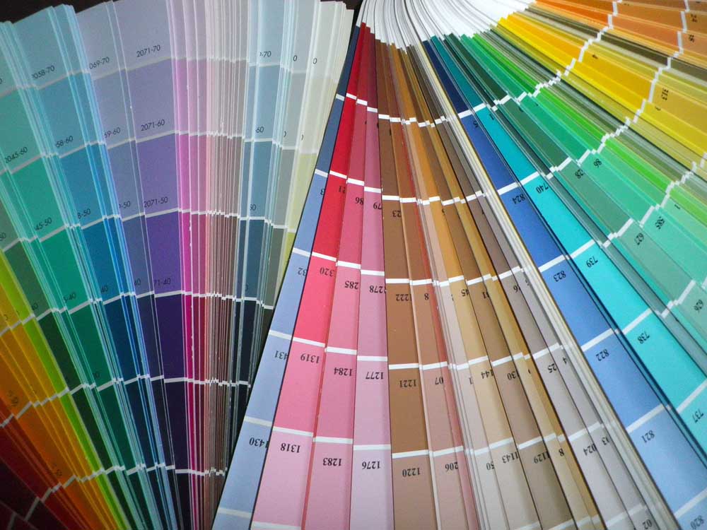
- The hot new colors of 2019 reflect our changing lifestyles. (Courtesy)
The start of the year is the perfect time to think about making changes to your home. Your changing story is reflected in your home through the choices of color you make.
Each year, the experts in color and lifestyle trends forecast the colors that resonate most with the times, culture and social climate. I always anticipate the unveiling of hot new color choices with excitement. Being aware of the trends helps us all be in the moment and stay up to date. I’m excited to share four go-to trendsetters in the world of color.
Sherwin Williams and Benjamin Moore are forward-thinking paint companies that unveil new palettes every year. Pantone, the leader in color intelligence, sets the trends for fashion, interiors, product and packaging. Heimtextil, the global authority on home textiles, forecasts lifestyle trends that affect us.
Many factors influence the direction of color: technology, culture, ancestry and the value of experience. Social and geographical landscapes are also influential.
The goal of good interior designers is to people make their surroundings feel peaceful and happy. The strategic use of color can have a profound and beneficial influence on mood.
I’ve separated the forecasts into three categories: color stories, lifestyle trends, and how to use color.
COLOR STORIES
Colormix 2019 from Sherwin Williams is a collection of 42 colors divided into six palettes based on lifestyle patterns. These are the six color stories, which you can download as a PDF at sherwin-williams.com, and use
as inspiration to write your own story on the walls of your home. Something magical
might resonate with you!
1. The Shapeshifter palette is a story of vision. Taking cues from the vastness of the universe, artificial intelligence and spirituality, the collection includes medium blue-gray Celestial, several rich shades of blue and a bit of green and gold.
2. The Wanderer palette, a fun story of free spirits and adventure, encompasses the earthy tones of leather, wool and desert clay. The 2019 Color of the Year is Cavern Clay, a warm terracotta inspired by the spectacular American Southwest.
3.The palette named Aficionado speaks of our well-worn favorites, appreciation and timeless elegance. It has dramatic shades of Merlot, tobacco, charcoal and olive.
4. Enthusiast, the brightest of the new palettes, is packed with color! Eclectic and full of high energy, this palette is inspired by passion and uniqueness. The emotions are told in vivid yellow, Positive Red and green.
5. Naturalist is a palette full of quiet colors that suggest leaves and gardens, mushrooms on the forest floor and delicate blooms. Hushed shades of Primavera spring green and Delightful pink tell this botanical narrative.
6. Raconteur is a palette woven with muted tones of taupe, ivory and orchid. It is influenced by ancestry, the luxury safari spice markets and our interwoven global connection.
LIFESTYLE TRENDS
Heimtextil anticipates five lifestyle trends in 2019 based on responsibility, sustainability and respect for one another and the environment. These shifts into a new way of living focus on play, the search for peace, getting back to nature, escaping into virtual reality and indulging in well-deserved comfort.
Happy pink and bright sunshine add just enough oomph to a room for that special feeling of playfulness.
The Pantone Color Institute’s Spring/Summer 2019 Fashion Report offers bright Pink Peacock, Living Coral, festive Fiesta red, and Aspen Gold, a bright cheerful
yellow. Interior design is influenced by fashion and your classic neutral spaces will spring to life with vibrant pops of color.
In today’s busy world of multi-tasking, noisy notifications and endless alerts, we long for peace and quiet. The serenity of gray offers much-needed calm.
Benjamin Moore’s 2019 collection of 15 curated colors suggests that silence is essential. Our daily lives of going, doing and being constantly connected need the balance of quiet that neutral colors provide.
The Benjamin Moore color of the year is Metropolitan, a graceful gray that effortlessly pairs with nearly anything. The stylish shades of Pashmina and Cloud White soothe the senses.
Head Over Heels is an elegant barely there off-white with a beige-blush tint. Balboa Mist is a peaceful off-white with a hint of gray. Breezy blue-gray Smoke connects us to the sky. Gentle Soft Fern, a wisp of delicate green, grounds us to the earth.
Rich, coffee Kona, dramatic Hunter Green and teal Beau Green anchor us in nature’s restorative properties.
View this sophisticated collection and play with the paints at benjaminmoore.com. You just might discover the feelings of calm in new color!
USING COLOR
All of these colors either coordinate with or complement colors from recent years. Gray has been making its way to the forefront of color trends for the last few years, as have strong anchoring greens, blues and a bit of yellow.
This year’s forecast builds on those colors, adding even more cheerful yellow, and introducing new happy pinks and essential earth tones.
Interior design’s popular colors remain steadfast for years because the investment in materials and furnishings is significant. Classics and neutrals never go out of style.
The finish of the paint is as important as the color. A satin finish softly reflects light, while glossy white trim looks amazing with anything.
Let your feelings guide your color selections. If you feel like your life needs more peace, then choose soft neutrals that emanate calm.
Maybe your life could use more pizzazz. In that case, you might like a bright shade for energy.
The most important thing when selecting a color is to go with your heart. A journey of color exploration just might lead you in a new direction.
Patricia Wilson is an interior designer registered with the Texas Board of Architectural Examiners. Connect with her at www.PatriciaCWilson.com .


-
eEdition
-
-
